Turkey Tourism Demand: What Actually Moves the Needle

Tools:
Jupyter Notebook & Python
Date:
Spring 2026
Context and Objective
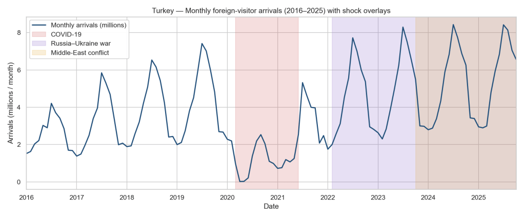
Tourism is one of Turkey’s largest sources of foreign currency, and every conversation about it eventually circles back to the same intuition: “the lira is cheap, so more people will come.” I wanted to test that intuition properly. Pulling 15 years of monthly data from four very different sources, I set out to answer one question: what really drives foreign arrivals to Turkey, the exchange rate, intent (Google searches), or something else entirely? The honest answer turned out to be less flattering than the intuition, and the path to it, including a round of fixing my own inference, was a small masterclass in why real-world data work looks nothing like a Kaggle CSV.
The Data Challenge
The analysis touches four sources, and each one fought back in its own way:
– EVDS (Central Bank of Türkiye) for TRY exchange rates against EUR, GBP, USD, RUB and the Turkish CPI. The EVDS Python client silently rewrites column names. Every . in the series code becomes _ on the way back, so my naïve rename map quietly produced empty columns until I figured out what was happening.
– FRED for monthly CPI indices for Germany, the UK, the US, and Russia. Two wrinkles here. The OECD-MEI Russian series ends in March 2022 because the OECD stopped publishing after sanctions, so anything involving real RUB/TRY is structurally capped at that date. The OECD-MEI German series was discontinued too, so I migrated it to the Eurostat HICP index, which is monthly and currently updated. For the UK there is no currently-updated monthly index series on FRED that fits the real-FX construction, so the UK series stays on OECD MEI and caps that part of the sample at March 2025. In both cases I treated the gap as a constraint to document rather than something to paper over.
– Google Trends for search-intent indices on Turkish-tourism keywords across DE, GB, SA, AE, and RU. Trends rate-limits hard and pytrends’s own retry logic uses a urllib3 kwarg that was removed in 1.26, so it crashes instead of backing off. I disabled its retries, wrote my own exponential backoff with jitter on 429s, and accepted that the fetch step takes about five minutes per run. There is a deeper catch: Trends indices are re-scaled per request, so every re-fetch produces slightly different values. The committed CSV is the analysis dataset of record; the pipeline is deliberately not bit-reproducible on the Trends side.
– TÜİK (Turkish Statistical Institute) ships monthly arrivals as a single Excel workbook with stacked blocks. One block per year span, each with its own sub-headers, year cells stored as floats (2016.0), and Turkish month labels. Parsing this needed a tiny Unicode rabbit hole: "İ".lower() in Python yields i + combining dot above, not "i", and "ı" has no NFD decomposition, so any normal unicodedata pipeline silently mis-matches half the month names. I built a translation table that handles both quirks, then walked the sheet block by block to extract the “Toplam” column per year. There are unit tests on that parser now, because there should be.
None of this is in any textbook. All of it is what the job actually is.
What I Found
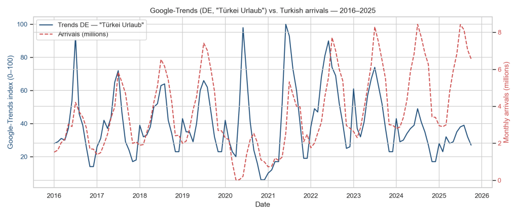
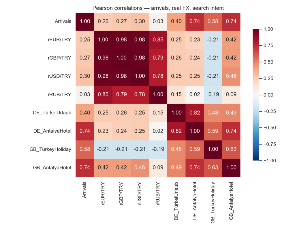
The famous “Google searches lead arrivals by one month” turned out to be a seasonality artefact. On the raw series it looks beautiful: German search intent peaks against arrivals at lag +1 with ρ = +0.51, British at lag +1 with ρ = +0.70. That was my original headline. But both series carry the same summer cycle, and a raw cross-correlation mostly measures that shared cycle, not information. When I repeated the analysis on 12-month log differences, with both sides deseasonalised, the one-month lead did not survive: the German peak moves to lag −6 and the British peak sits at lag 0. A strong-looking correlation that lives entirely on shared seasonality is the calendar talking, not the market, and any dashboard built on it would have been forecasting summer. That is a lesson worth publishing rather than hiding.
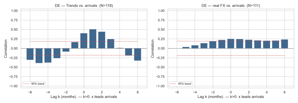
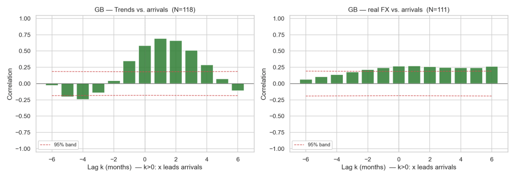
What survives deseasonalisation is the UK, and it survives properly. The one regressor that clears the 5 percent bar in the final specification is not the exchange rate at all. It is the year-on-year change in UK searches for “Turkey holiday” at a one-month lag: β = +0.86, p = 0.028. In plain terms, when UK search intent runs 10 percent above its level a year ago, arrivals run about 8.6 percent above their year-ago level the following month, after the summer cycle is stripped out. That is the real, defensible version of the leading-indicator story: free, forward-looking, and measuring deviation from the seasonal norm rather than the norm itself.
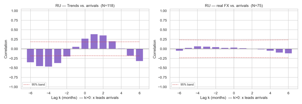
Russia broke the model in an instructive way, and the break lines up exactly with the war. Instead of reading one correlation across the whole sample, I split the Russian CCF at February 2022. Pre-war, search intent leads arrivals by one month with ρ = +0.72, exactly the holiday-booking pattern you would expect. Post-war, the relationship inverts to ρ = −0.72, with search now trailing arrivals. Searches fell at exactly the time arrivals rose. The most plausible reading is that post-February 2022, Russian flows into Turkey stopped being vacation traffic and started being relocations: people moving rather than holidaying, often via Turkey as one of the few remaining open routes. The data didn’t tell me this story directly, but a clean sign reversal in a previously well-behaved series almost always means the underlying behaviour changed, not the statistics.
The Exchange Rate Story
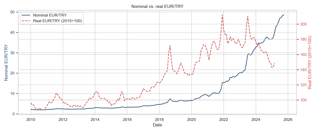
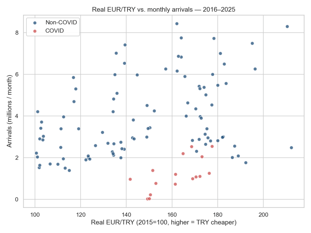
EUR and GBP move together. Their YoY real rates against TRY correlate at 0.86, and in a joint regression their VIFs both sit above 15, well past the textbook threshold for severe multicollinearity. When OLS sees two regressors that nearly co-vary, it has no stable way to split the joint elasticity between them: tiny perturbations in the sample reshuffle the coefficients. The fix is the boring one: drop one, or collapse them. With either currency isolated, or with the average of the two real rates as a single regressor, the sign is stably positive and the point estimates cluster around +0.8: roughly 0.8 percent more YoY arrivals per 1 percent of real TRY depreciation.
I want to be honest about how loud that signal is, because an earlier version of this article reported it louder. I originally published an elasticity of roughly +2 percent per +1 percent, sitting “at the edge of significance.” That number was fragile in three specific ways. My HAC standard errors used a bandwidth of 4 lags, too short for a year-over-year transform that mechanically induces an MA(11) error structure. My Trends regressors entered as raw seasonal index levels against a deseasonalised dependent variable, which dragged the FX coefficient around. And my COVID control was a single step dummy, which a YoY-differenced series cannot identify, because a permanent level shift only shows up in year-over-year terms for twelve months. Fixing all three, and then re-running everything on an extended sample, moves the verdict from “borderline significant with a nice sign” to this: the point estimate is directionally right, but the confidence interval includes zero in every specification, and when I drop the pandemic window entirely the coefficient collapses to essentially nothing. At monthly aggregate frequency, with this sample, the FX channel is not a robust structural feature of the data. Anyone who tells you they can predict next quarter’s arrivals from the lira alone is selling you something, and for a while that someone was me.
What This Means In Practice
For a tourism operator, the actionable result is UK search intent, in year-over-year terms, at a one-month lead. Put the YoY change of “Turkey holiday” searches on a dashboard: when it moves in month t, expect arrivals to move in the same direction in month t+1, with an elasticity around 0.85. The old raw-correlation version of this advice would have had you forecasting the summer; this version forecasts the deviation from it, which is the part you can actually act on.
For a policymaker, the exchange-rate elasticity is a lever the data does not support pulling. Even the point estimate, around +0.8 percent of arrivals per 1 percent of real depreciation, would be small next to what a weak real exchange rate does to the rest of an import-dependent economy. A confidence interval that includes zero, and a sign that flips when the COVID window is dropped, means the aggregate monthly evidence is nowhere near strong enough to design tourism-tuned FX policy around.
For an investor, the Russia inversion is the most interesting datapoint. When Russian search interest for Turkish holidays and Russian arrivals to Turkey decoupled in 2022, searches falling while arrivals rose, that wasn’t noise, it was a regime change. Tourism flows from sanctioned economies stopped reflecting vacation demand and started reflecting capital and people in motion. That has direct read-through to Turkish real estate, retail banking on the southern coast, and any business whose revenue mix depends on which kind of Russian shows up. A correlation of +0.72 before the war and −0.72 after it is as clean a structural break as time-series data ever hand you.
Limitations
I’d rather be the one to name these than let a reader find them.
– Aggregate arrivals mask country-level heterogeneity. I’m regressing total foreign arrivals on a small set of macros, which means I’m averaging behaviour across 240-odd source countries. A German visitor and a Saudi visitor respond to very different things; collapsing them into one series throws away most of that signal.
–The YoY transform costs me a year, and the UK CPI gap costs a few months more. After differencing, the specifications run on roughly 100 monthly observations, and the ex-COVID robustness cut shrinks that further. Enough to detect a large effect; not enough to slice a small one cleanly by sub-period.
– Residual autocorrelation is still there. Durbin-Watson sits between 0.9 and 1.2 across specifications. The Newey-West bandwidth of 12 lags keeps the inference honest against the MA(11) structure the YoY transform creates, but a static OLS is leaving dynamic structure on the table.
– Stationarity is not a clean call for the FX series. ADF and KPSS disagree on the YoY real EUR/TRY series: ADF cannot reject a unit root, KPSS cannot reject stationarity. Given ADF’s known low power on a sample of about 100 observations I proceed treating the series as stationary, but the FX inference should be read as fragile for this reason too.
– Russian CPI ends March 2022. OECD stopped publishing after sanctions; FRED has no successor monthly series. Anything involving real RUB/TRY structurally ends there. I treated it as a constraint instead of inventing a proxy.
– Google Trends is not reproducible bit-for-bit. Indices are re-scaled per request, so re-fetching produces different values. The committed dataset is the analysis dataset of record.
What I’d do next
Three concrete moves, in order of payoff.
Country-level panel. TÜİK gives me arrivals broken down by country of origin. Going from a single time series to a 25-country panel changes the question from “what moves total arrivals?” to “which countries respond to which shocks?”, and gives the FX channel a chance to show up market by market where the aggregate washes it out. The Russia inversion alone would be far easier to identify cleanly with a panel.
A proper REER basket. Instead of regressing on individual real bilateral rates and then arguing about which one to keep, build a tourism-weighted real effective exchange rate using each origin country’s share of arrivals as the weight. That sidesteps the EUR/GBP collinearity problem by construction rather than by dropping a regressor.
A dynamic specification. AR(1) on the dependent variable, distributed lags on FX, and re-run the diagnostics. A Durbin-Watson around 1 is the residuals telling me the static OLS is leaving information on the table. I’d start with an ARDL and let the lag structure earn its place.
Technical stack
Python end-to-end: pandas for the panel build, statsmodels for the OLS, Newey-West HAC, ADF, KPSS, and VIF diagnostics, evds / fredapi / pytrends for the API pulls, openpyxl for the TÜİK Excel parse, and matplotlib + seaborn for the figures. Everything orchestrated through Jupyter, with the notebooks programmatically generated from .py builders so the analysis is reproducible end-to-end: nbconvert --execute runs the whole pipeline from a clean checkout, and python -m pytest covers the parsers.

